Foundations for Awesome Animation
Hey everyone, this is the second in a series of three blog-posts about Tove. Last week we talked about the evolution of her visual design (you can read it here if you missed it), this week we're going to talk about some of the ingredients of her animation set-up. I'll try my best to avoid getting too technical so that it's a good read for all but you may have to bear with me at certain junctures. Some background information upfront, we're using Unity (a game engine) and Maya LT (3D modelling/animation software) to develop Röki so some of the techniques we discuss below relate to them.
Firstly, let's talk about what our goals were, there were a few key points we wanted to hit:-
- Sometimes 3D characters can appear a little rigid, they can lack the squash and stretch of traditional hand drawn animation so we wanted to see what we could do to improve that.
- We also knew we wanted to heavily utilise secondary motion on elements like her bobble hat and ponytail to give sophistication (make it look awesome).
- We needed to be able to animate the face and body independently.
The last point is an easy one so let's hit that first. It was essential that we had the ability to play one animation on the body (a walk, wait or run for example) whilst playing a separate animation on the face (happy, sad or tired). Fortunately this was very easy to set-up using Unity's animation layers. We simply used an Avatar mask to mask off the body's animation data from the face animation and vice versa with the body animations. This allowed us then to play animation independently on both the face and body at the same time, job done!
One of the key ingredients we were super keen on was to introduce some squash and stretch into Tove, to get away from a super rigid 3D character. We did this in a number of areas but the first element we'll talk about is Tove's head.
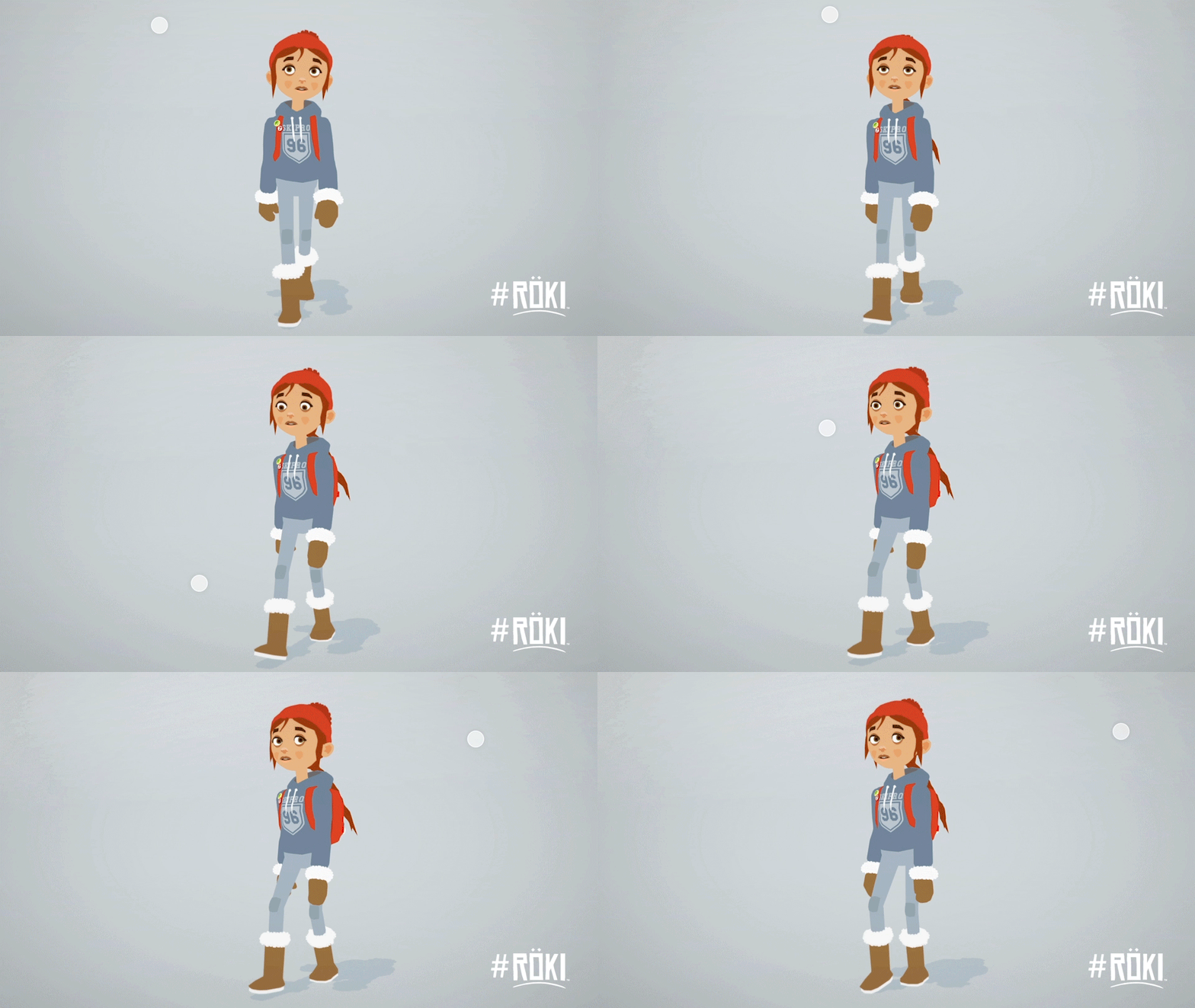
Now, it's not anatomically correct in anyway whatsoever (and actually sounds a little horrific!) but we have included the ability to translate (slide) Tove's head up and down her neck! This gives us the opportunity to compress and extend her neck making the character feel less rigid when animated and also allows us to really go to town on her animations. We mostly use it in quite subtle ways, but it's used in pretty much every animation (it's used in her walk for example).
We actually have two head joints in Tove's skeleton. One that does this sliding, the other one that does some squish/scaling (we'll talk about this one next week in the facial set-up blog-post). The reason why there needs to be separate joints for each of these actions ('slide' and 'squash') is so that each can be assigned to a different animation layer, the 'slide' animated with the body layer, and the 'squash' animated with the head layer.
The head is not the only part we wanted to 'squish' and 'stretch'. Tove's feet also have extra joints to allow them to spread and scale when she plants her foot. This really help to depict the her taking the weight of her body as she walks or runs. This was something I took from doing a Animation Mentor (an online animation training) course in creature locomotion a few years back. We were taught to spread the toes of a lion as they plant their paw, taking the weight of the body to try and sell the compression and transference of weight. This is the same principle but applied to Tove. Again, you probably won't have noticed it (although if you take a close look at the below GIF you'll see it!), that a good thing, it's the cumulative effect of layering these elements that make a big difference, if overcooked it would look super weird.
The last element we'll talk about is secondary motion. We touched upon the inclusion of secondary motion elements in the character design process last week. These are the elements we wanted to flap, lag and trail as Tove moves around the world (think of Batman's cape or Lara Croft's ponytail). Again, these stop the character feeling like a great big rigid lump and help to sell weight shift, impacts and direction.
There are quite a few of these elements on Tove (the hat bobble, ponytail, hoodie drawstrings, hair strands) and they're all driven by physics. By this we mean that they are simulated at run-time in Unity (when the game runs) rather than been driven by animation we have created. This is a big win in a number of ways:-
- It looks super realistic as it's a simulation.
- We don't have to animate those elements which would be very time consuming (the ponytail in the announce trailer was hand-animated and that was a painful time that we won't talk about!)
- Most importantly, as the physics driven parts are independent to the underlying animations, they help to smooth our and mask the animation transitions of the main character (as they overlap them)
As a note for anyone that's interested we use Unity's Character Joints for the all these dynamic elements aside from the ponytail which uses Unity's Cloth component.
Right, that's it for another week. Have a nice weekend everyone, next time we'll talk about Tove's Facial set-up
Cheers,
Alex & Tom


